FINAL IDEA EXPLANATION
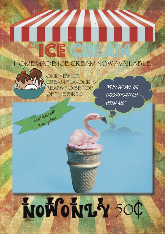
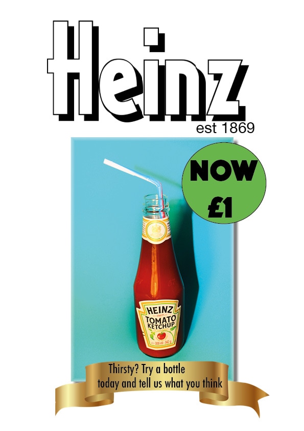
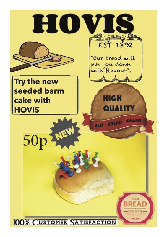
For my final idea i decided to create a few posters with the images i had created throughout the project. The posters i have designed have been designed to make it look like advertisement posters. I decided to out the photos i've edited into the poster and advertise it to make it look like i'm genuinely selling the product. This adds the final humour to the image seeing the product advertised on a poster ready for sale. I have tried to go for a retro approach to the posters making it look old because i think the use of old banners and fonts and posters which i researched about really look fun and creative which i think links to the fun aspect of this project. I have tried to include a mix of images into the posters including some which i took not linked to any previous artists. The difficulty i had with creating these posters is the software used 'InDesign" which was software that i wasn't familiar with and this is why, with the short amount of time i had, that the posters were not how i had planned for them to come out as. I think while researching the posters a lot of retro posters include artistic cartoons which just wasn't suitable to design within the timeframe so i did use free non copyright clipart within the posters to try and link these posters to the retro look i wanted. Within some of the posters i used striped and brown coloured backgrounds which benefited me because it looks retro however inserting my photo into the poster (which are very vibrant and bright) looked out of place so i had to use plain simple colours on some of the posters however i do think these have the same look as the advertisement posters i want.

Making process of this final piece
This was my first time using Adobe InDesign and it was quite difficult to use. With little help on the software i found it quite hard to make what i hoped i planned to do. But here i started off with an blank A4 page which was what i started off with to create the posters.
The sidebar at the side is what includes all the tool bars needed for you to create and design the posters.
The sidebar at the side is what includes all the tool bars needed for you to create and design the posters.
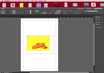
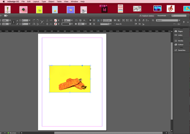
Images would have their own place holder and also a frame this can be seen in the 2 images at the bottom. The golden border would represent the size of where the image would go if it was to be stretched and the blue border would show how wide the image can go if the picture went over the blue border this would mean the image doesn't show past the blue border which was annoying throughout making this.
Below you can see how one of the posters are coming together. In the one shown below you can see the frame borders of the A4 template giving me guidelines as to what i need to be working in. The font tool is being used in this to type sentences in the poster. This tool is marked out by the letter 'T' in the software. It gives me a variety of fonts and sizes and places which allows me to work with multiple fonts.